Redesign of M2P's Forex Portal
It was pandemic, and the travel sector witnessed a significant downturn. We seized the opportunity to undertake a redesign of the forex portal of M2P, recognising that there would be minimal active usage during this period. Developed a well-defined strategy, with a phased approach to minimize disruptions and ensure smooth transition for the existing users.
Forex Portal of M2P
Clients experienced limits in terms of missed opportunities, lack of integration capabilities with existing tools, difficulties reaching out to M2P for support. Also, the portal lacked of intuitive navigation and the cumbersome processes slowed down users. This reduced efficiency, and had an impact in productivity among the client's employees, which affected the overall output and profitability of M2P business. People also started sharing negative references, and another major reason was that the clients didn't find it worth the money.
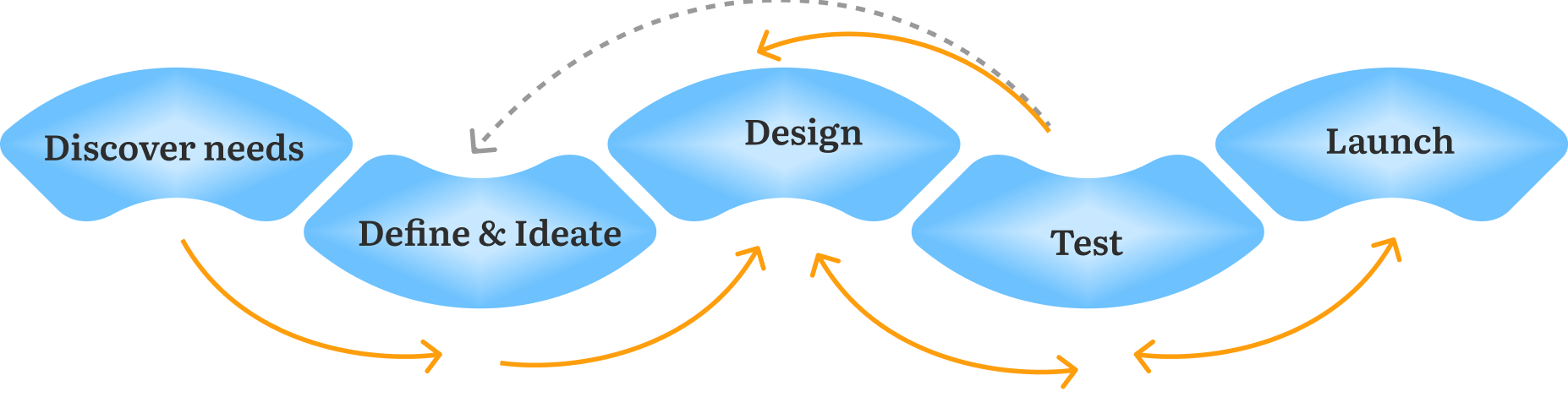
Connected with the product owner, technology team, business development, implementation, and users to gain a profound understanding of the challenge at hand. The primary objective was to improve design without jeopardizing the existing user base, and gradually earn their trust. Carried out a competitive analysis to understand where the competitors are doing better, and where we are doing better. It gave us insights, inspiration and enabled us in crafting UX that exceeds user expectations. The insights also helped BD and sales, position the product effectively in the market, and also in the pricing strategy. Obtained a clarity on the dependency of different teams, and arrived at a comprehensive redesign strategy for 8 modules.
To understand the current challenges faced by users and to learn more about their expectations, we conducted one-on-one remote interviews and usability testing with real users, specifically the bank personnel. Accessing real users in B2B environments was challenging due to security concerns. Despite the obstacles, I managed to secure users’ time and participation in the research. The exercise yielded a plethora of new findings, that were a surprise to both business and clients.

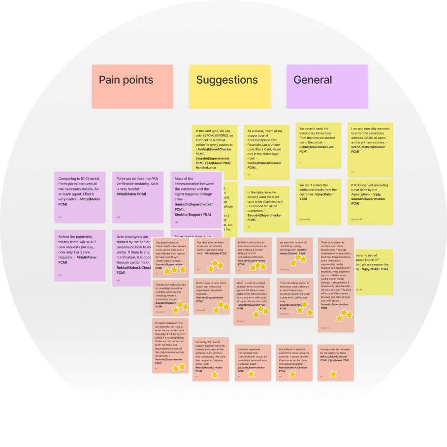
Recognizing the value of diverse perspectives, I ensured that the entire team takes part
in analysis. We identified patterns by grouping similar insights and cross-verified data
from various sources or methods to ensure the robustness of results.
The outcome of our analysis was a compilation of actionable insights. Working closely
with the technology and business teams, we prioritized the necessary changes and
features based on our findings.
Created customer journey, that reflected what the customers are . ‘thinking, feeling and doing. . This helped as a visual aid for stakeholders, particularly those in the tech team understand the context better and made them foster a more inclusive approach.
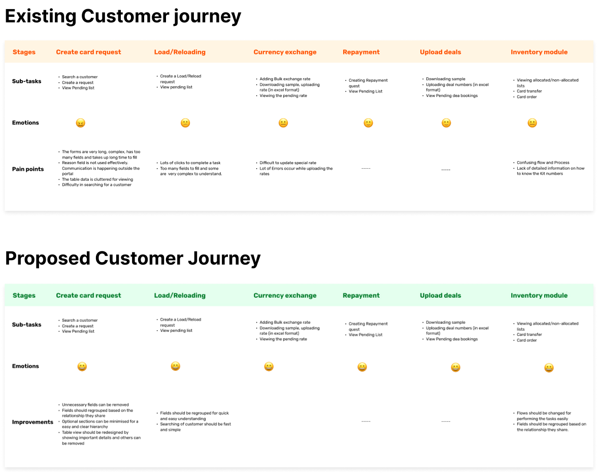
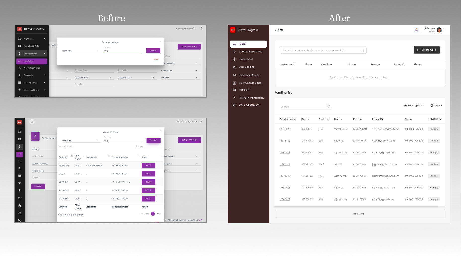
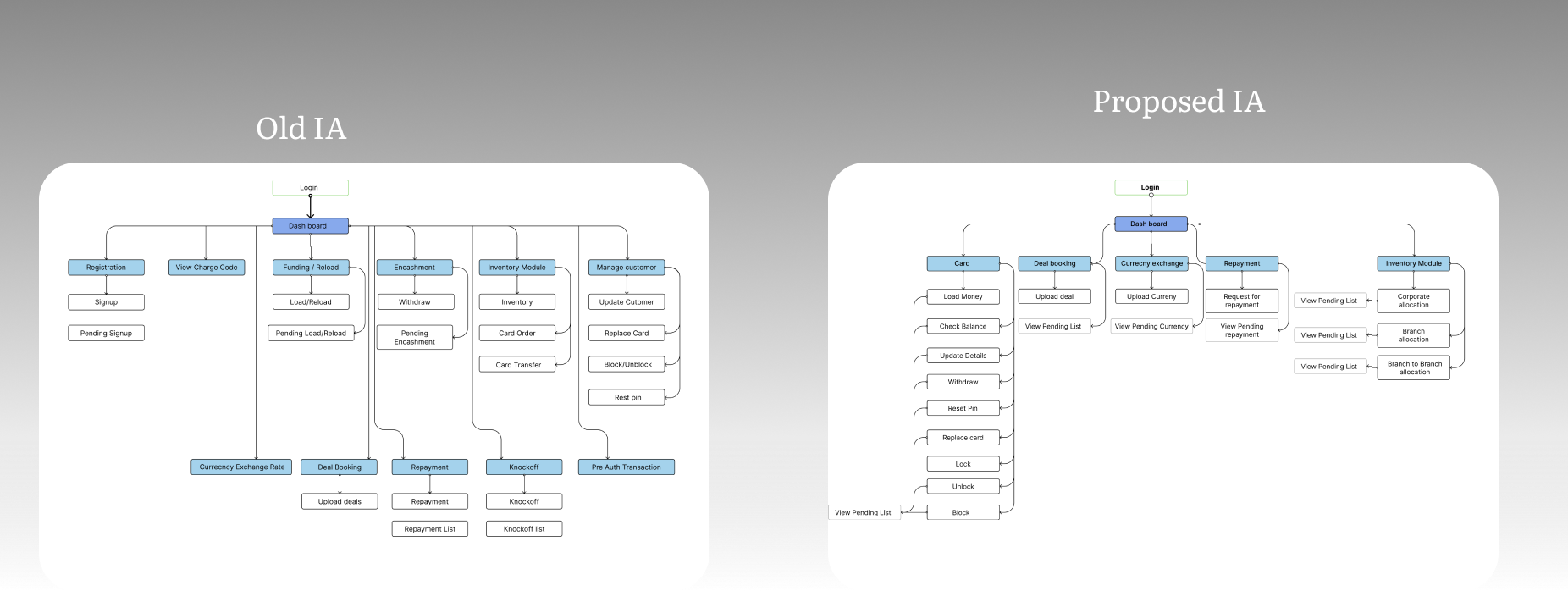
We recognized the need for a change in the Information Architecture (IA) to enhance the user experience. After extensive discussions and strong user advocacy, we successfully implemented IA changes in a phased approach.
In close collaboration with the product owner, technology team, business development,
implementation, and users, crafted a comprehensive redesign strategy for 8 modules, without
risking the current user base. Obtained a clarity on the dependency of different teams, and
arrived at a plan for redesign. . In every step of the process, I ensured that the technology
and business is involved in the design decisions made.
Achieved a 30% improvement in task completion times, slashed customer support requests by 50%,
reduced training needs by an impressive 70% as the portal now is contextually relevant than ever
before, and the users were glad that they didn’t have to juggle between multiple portals and
contexts anymore.
